Page 1 of 3
Using a nicer Button "Pressed" state (than the default square)
Posted: Sun Mar 18, 2018 2:31 am
by teriibi
Hi,
Does anhone knows if there is another better looking "Pressed state" that can be displayed after a button has been pressed down.
This is what the default one looks like on a round rectangle button. I wish I can remove it and use something elese.
This next capture is made from an Android Device and Not from the LC IDE (where it looks different).
(The Square thick selection surrounding the rounded corners is not very appelaing to me

)
(Pressed state is shown/zoomed at the top- while Bottom part is when button is at normal state---
thanks for mentioning any alternative ways of displaying a "pressed state"


Re: Using a nicer Button "Pressed" state (than the default square)
Posted: Sun Mar 18, 2018 9:52 am
by richmond62
I very rarely bother with LiveCode's in-built buttons, and tend to use images as buttons:
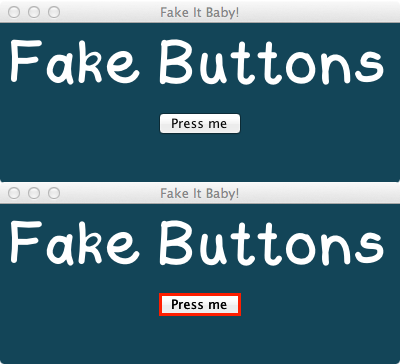
- FIB.png (32.99 KiB) Viewed 8424 times
File removed as updated version available further down this window.
Re: Using a nicer Button "Pressed" state (than the default square)
Posted: Sun Mar 18, 2018 10:42 am
by jmburnod
Hi,
If i understand you correctly, You may use a checkbox btn with two imgs for icons.
Best
Jean-Marc
Re: Using a nicer Button "Pressed" state (than the default square)
Posted: Sun Mar 18, 2018 11:21 am
by teriibi
Thanks Richmond,
I thought of using SVG once...will check your stack and if noone comes with some nicer tip...
What tool do you use do you create any specific text titles buttons to meet all your need

I dont get how this fake button exist and work -

- not a real SVG, right ?

Re: Using a nicer Button "Pressed" state (than the default square)
Posted: Sun Mar 18, 2018 3:02 pm
by bogs
That isn't bad Richmond, although teriibi might want to change the one without the red line to the mouseDown message if it isn't a toggled button, and set the 2nd to mouseUp. Then it would behave more like an actual button.
Of course, you don't have to use images at all, similar things can be done with the built in graphics in Lc itself. Keep in mind, though, that
..1. they worked hard to maintain the look of a (button, field, etc) that looks native to the os it is on, and
..2. your creation may not look as close, and
..3. the image you posted is pretty well blown up, I doubt most people even see it in regular use where a button click takes less than a second to perform.
Aside from all of the above, since I mentioned making them with nothing but livecode, heres a couple of similar examples I did when I first started learning Lc. One is a list of actual buttons that went into a program, the 2nd was to test how buttons would react/look in certain situations and with different properties (unfinished, mostly just the top row works heh). Should work from v6.x to current I would think. Hope you find it helpful.
*Edit - for smoother lines set the antialiased property on the graphic.
Re: Using a nicer Button "Pressed" state (than the default square)
Posted: Sun Mar 18, 2018 7:32 pm
by richmond62
Here's a thought:
on mouseDown
set the borderColor of me to green
end mouseDown
on mouseUp
set the borderColor of me to yellow
end mouseUp
on mouseEnter
set the borderColor of me to red
end mouseEnter
on mouseleave
set the borderColor of me to blue
end mouseleave
Try it:
Re: Using a nicer Button "Pressed" state (than the default square)
Posted: Sun Mar 18, 2018 8:53 pm
by bogs
Yup, thats pretty much the code in the stack I posted, all stuck in the stack level script. GMTA eh? Heh.
I should have mentioned, if you stick code like that where I do, if you handle one of those messages higher, remember to put 'pass mouse(handler)' so that it does what is going on in the stack too.
Re: Using a nicer Button "Pressed" state (than the default square)
Posted: Mon Mar 19, 2018 1:24 am
by teriibi
Ok, i m happy witht the shadow effect from start and if i can find the way to hide this Shadow when pressed (along with the Square selection - to eventualy add a surrounding Glow white light in place of those two effects... that would be enuff to me.
(doesnt make sense to me to still display a shadow when your button is down. right ?..and a Glow white light would fit any stack background in case I d change its color)
A Glow style as those fancy Power On buttons with a surrounding ring Led light.
Re: Using a nicer Button "Pressed" state (than the default square)
Posted: Mon Mar 19, 2018 7:04 am
by bogs
Well, all that stuff can be done, a great deal of it can be done without writing a line of code to do it. Shrinking shadows and re-growing them would require coding, but it isn't horribly difficult, probably 2-4 lines.
Re: Using a nicer Button "Pressed" state (than the default square)
Posted: Mon Mar 19, 2018 4:43 pm
by teriibi
Cant find tjhe oposite of :
Code: Select all
set the dropShadow of button "BHD" to empty

not true...full...normal...ignite
Re: Using a nicer Button "Pressed" state (than the default square)
Posted: Mon Mar 19, 2018 4:55 pm
by bogs
Try 'dropShadow' in the dictionary or in
Max's wiki -
dropShadow["size"]
...The size of the shadow, i.e. how large the shadow is. This is between 0 and 255.
You can experiment with all these settings in the property inspector under 'Graphic Effects'.
As a simple test, put a graphic on the stack, the code for the graphic is
Code: Select all
on mouseDown
// smaller since the graphic is theoretically lower in height...
   set the dropShadow["size"] of me to "5"
end mouseDown

on mouseUp
// larger since the graphic is theoretically higher off the card...
   set the dropShadow["size"] of me to "10"
end mouseUp
Re: Using a nicer Button "Pressed" state (than the default square)
Posted: Tue Mar 20, 2018 12:17 am
by teriibi
Yop, I had seen both before I posted the question...
(I always do now)
So I tried Normal..but didnt help.
os instead of showing/hidding...the idea ir more towards setting the Shadow on 0 or More to
get a simialr result, right ?
Re: Using a nicer Button "Pressed" state (than the default square)
Posted: Tue Mar 20, 2018 1:49 am
by teriibi
Thanks Bogs,
The Set Shadow to 0-255 will do the Job as for me ! I had not try that one since I focused on the empty/??? value (so many test to do try before finding the right prop/value)
So actualy what would be the Word to get the Shadow prop. back seems to be a mistery, one can easely remove it but not get it back..!
Re: Using a nicer Button "Pressed" state (than the default square)
Posted: Tue Mar 20, 2018 3:16 am
by bogs
The same code I put up there puts a drop shadow of the size your looking for, whether there was one there or not previously.
Re: Using a nicer Button "Pressed" state (than the default square)
Posted: Wed Mar 21, 2018 1:30 pm
by teriibi
thanks again. Somehow I had failed testing it...
